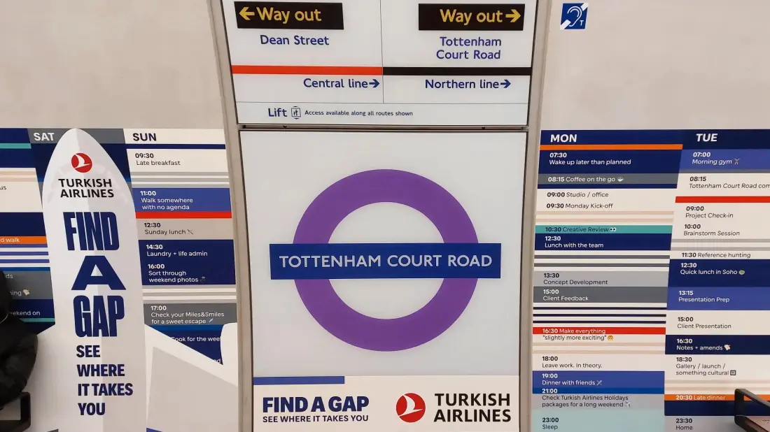
This is a fairly quick post on the new large scale advertising on the Elizabeth line. I first saw these in the afternoon of Monday 19th October from a train I was travelling in through the core section. A focussed attempt at photographing this advertising was made today – Wednesday 21st October 2026.
This new advertising, which was reported in todays Evening Standard, is not much appreciated by London’s commuters:
Some users… have dubbed the new campaign “garish” and “horrible”, explaining that the adverts “ruin” the Elizabeth line’s “elegant restrained design.” (Evening Standard).
There are complaints also that the new advertising compromises the wayfinding and other information. Certainly there is that – however I think TfL will insist it had conducted the usual assessments prior to having the advertising launched at its stations.
If you are a graphic designer , or fan of the @TfL roundel or the stripy ghost people behind @ElizabethLine platform seats – look away now😱. This garish ad campaign for Turkish Airlines is so horrible & ruins the elegant restrained design of the Lizzie stations. https://t.co/XmfklxEDLe
— Sarah Gaventa (@sgaventa) October 20, 2026
There’s many concerns that the advertising has spoilt the Elizabeth line’s stations.
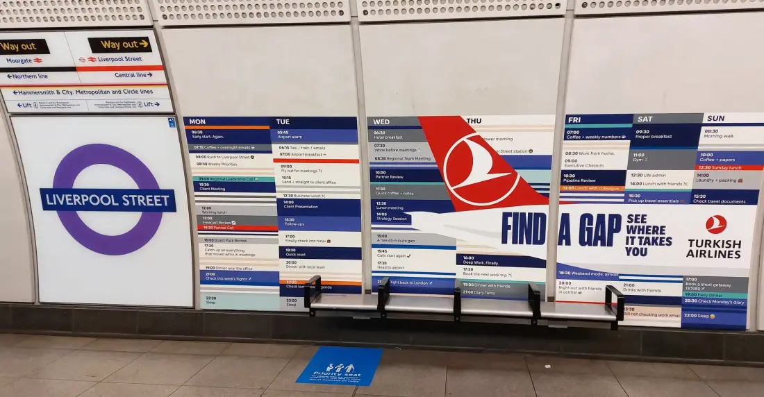
One of the two main styles of Turkish airlines advertising.
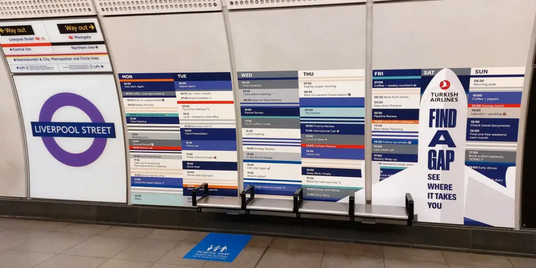
The other of the two main styles of Turkish airlines advertising.
Anyway, instead of having the colourful ‘patches’ to cover the dark ‘shadows’ behind the seating, TfL have taken the idea a number of steps further and replaced these with considerable advertising medium. The first is for Turkish Airlines and involves advertising throughout the central core stations (Whitechapel excepting). Each station has similar advertising, however each station also has itself mentioned in the ‘diaries’ that are spread across the station walls. Thus there’s a minutiae of variation within each station’s advertising.
Not only that, each station’s advertising contains further variations too. Tottenham Court Road for example has differences not seen at the other stations – including swathes to continuous three and four panel advertising – and these even though they are mirrored on both platforms, are different still because the westbound and eastbound platforms are of different lengths. Additionally the layout of the station roundels and station maps are different too – so this has also forced the two platforms to adopt slightly different layouts and it means the eastbound platform has a longer four panel section of advertising because there’s two extra roundel signs plus a station map in between the sections.
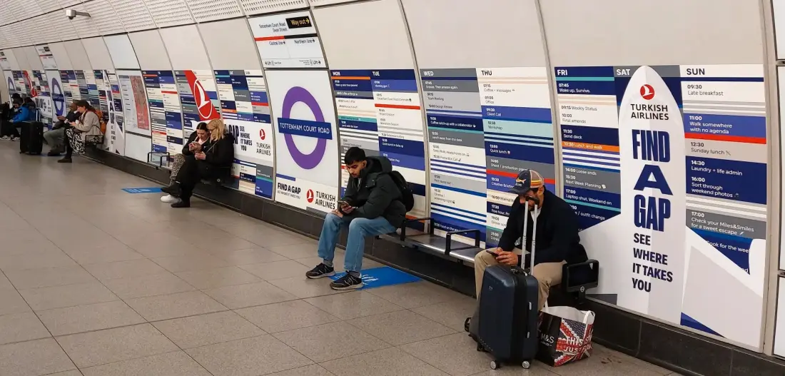
Tottenham Court Road station with its continuous four panel section of Turkish Airlines advertising. This is the westbound platform.
Farringdon also has a different style to the other stations and this is because the seating arrangements here are different. Instead of seating that consist of four places, Farringdon has eight, and so this has required a different format which contains elements of both pairs of the Turkish Airlines advertising seen at the other stations, but it also has differences because the seating isn’t spaced out sufficiently so there’s a shorter ‘diary’ week added to the ends the make up the shortfall – and these contain diary entries for Monday to Saturday opposed to all the others which have the full week – eg Monday to Sunday at the other stations throughout the core section. Again these additional Mon-Sat panels at Farringdon contain further differences to the others including the various diary entries being placed in a different order.
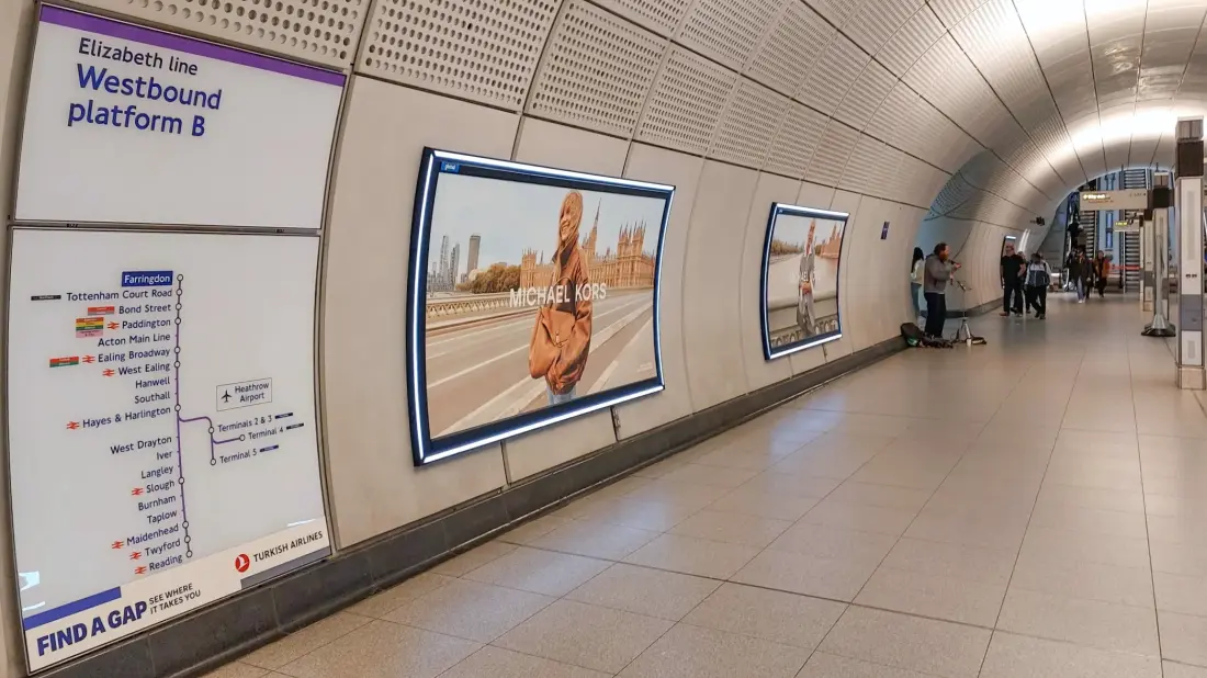
Liverpool Street with its odd out Turkish Airlines advertising on the station’s westbound route maps.
The other interesting thing is the westbound platforms at each station (that is, Liverpool Street, Farringdon, Tottenham Court Road and Bond Street) contain more advertising than the eastbound ones. This comes in the form of the station line maps for its only those linked to the westbound platforms that have the Turkish Airlines advertising. The westbound platforms lead to Heathrow where Turkish Airlines’ operations are based. Even these have differences in how the typeface is set out. Generally these are set in a way that the main wording is above the tag line. However at Liverpool Street the main wording (Turkish Airlines) and the tag lines are on one level. This is because the Elizabeth line route maps at Liverpool Street are of a larger size hence there’s less spacing at the bottom for the advertising. So that’s another variation in what is meant to be consistently presented advertising.
This new advertising is clearly intended to maximise revenue from the Elizabeth line by other means than the limited space that’ ha’s been available so far – including existing space at the stations and on the trains. The vast white GPR walls at the stations evidently have proved to be a sort of enigma so far in how they could be used for and even if the space could be utilised. There has been talk of using the vast spaces for large scale advertising, but so far nothing has been seen and this Turkish Airlines attempt is the first. There’s no doubt this could also extend to the cavernous interconnecting corridors and even escalator shafts. But let’s not speak too soon for that has already happened!
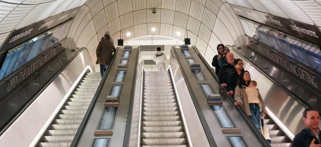
TfL have now placed large scale advertising on its Elizabeth line escalators. These are at Bond Street however the advertising is different to the Turkish Airlines collab.
TfL have also added large information panels on the station floors underneath the seating to denote that some seats are intended for PRMs. These are designed to give more impact and make people better aware that these seats are for those who need these. Its evidently a better approach than the usual means which has always been small stickers on the back of the seats or on the wall behind – and often people do not take much notice of these.
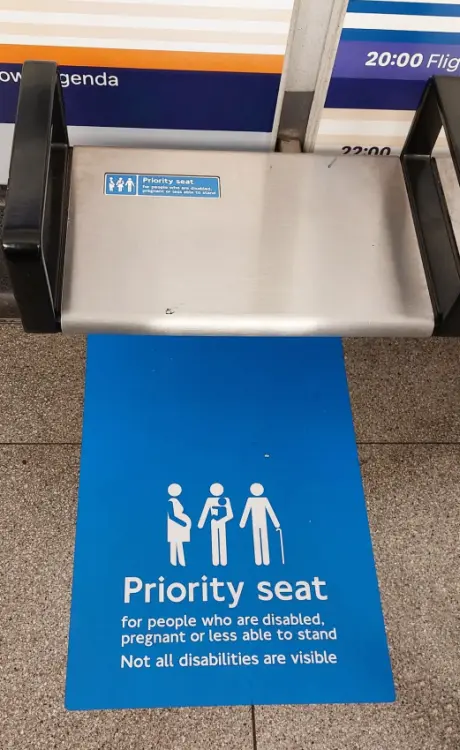
The Elizabeth line core stations’ priority seats are better highlighted with these new floor style information decals.
Interestingly the Turkish Airlines advertising will be in place for a year! Certainly its a considerable revenue income for TfL.
Leave a Reply